Overview
HappyCow is the world's leading platform for plant-based dining — a global community of millions of users finding vegan and vegetarian restaurants. But the platform had a gap: smaller, local restaurants were getting lost, and younger users weren't engaging deeply with the app.
Our team of four designers partnered with HappyCow advisors to redesign the app's social layer. My contribution was the Weekly Menu Highlight — a feature I proposed and developed from research insight through high-fidelity prototype — designed to amplify small vegan restaurants while building authentic community engagement.
The Challenge
HappyCow framed the brief around a B2B question: "How might we help HappyCow better understand the needs of vegan business owners and develop features to enhance its B2B model?"
But the real tension was a two-sided problem:
- Business owners felt invisible on the platform. Smaller restaurants had no reliable way to get featured or stand out from larger chains.
- Consumers — especially younger users — wanted a more interactive, community-driven experience. Star ratings weren't enough.
The feature I designed needed to serve both sides at once.
Research
We went deep before opening Figma. The research phase had five distinct steps.
Step 1 — Define the Questions
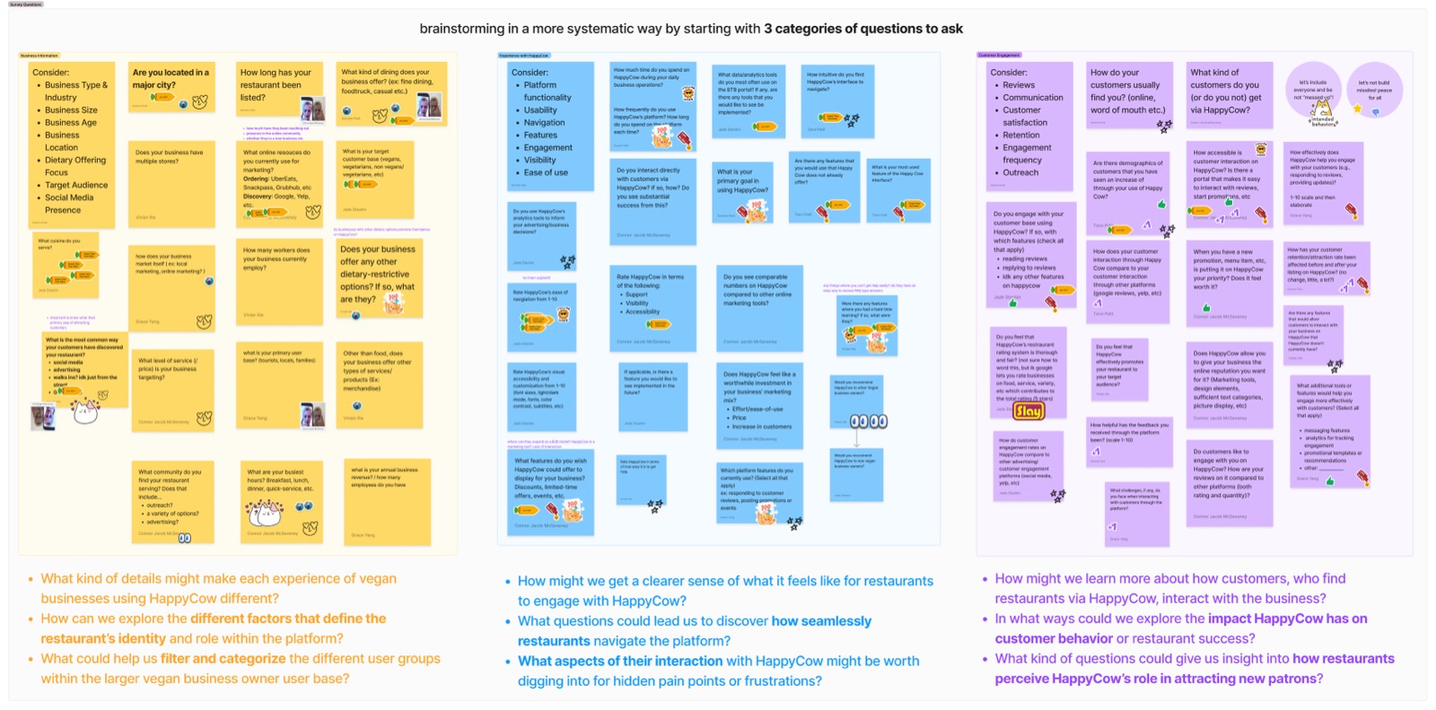
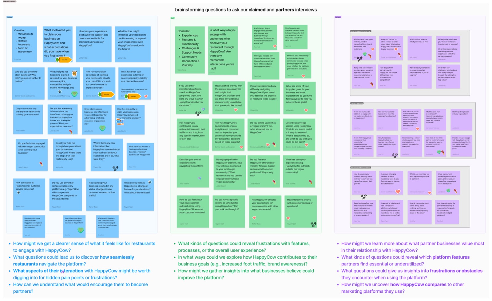
Before talking to anyone, we mapped out what we needed to learn. We ran separate ideation sessions for survey questions and interview questions — making sure we were asking the right things of the right audiences.
Survey question ideation — defining what we needed to learn from plant-based consumers.
Hover over image to magnify
Interview question ideation — building the question framework for business owner conversations.
Hover over image to magnify
Step 2 — Conduct Research
With business owners:
- 20+ interviews with vegan restaurant owners worldwide
- Explored visibility pain points, platform expectations, and what "success" looked like for them
With consumers:
- 50–100 survey responses from plant-based diners
- Competitive analysis of food and review platforms
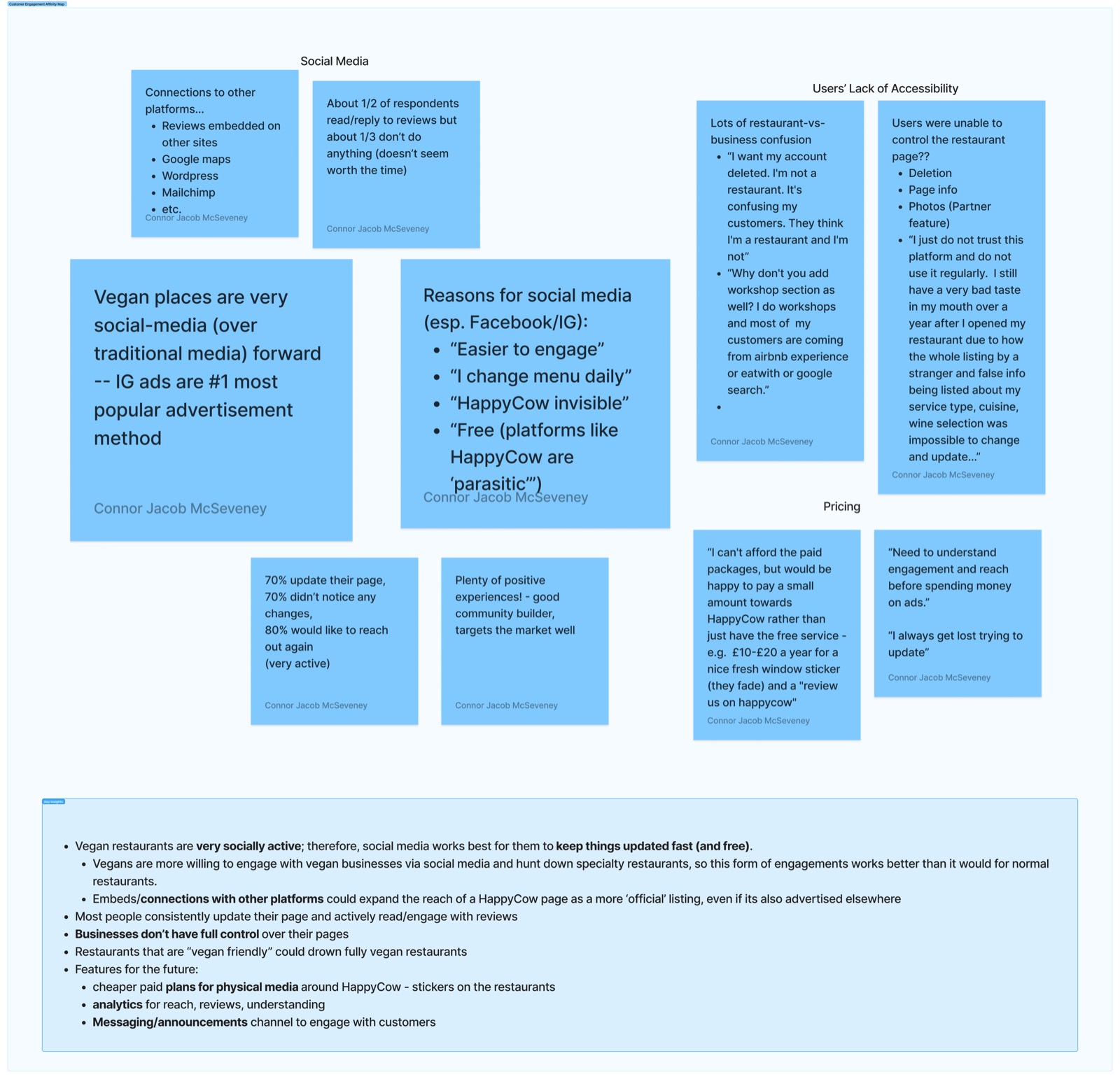
Step 3 — Affinity Mapping
With ~100 survey responses and 20+ interviews, the challenge was filtering signal from noise. We built affinity maps across three themes — Customer Engagement, Features Use, and Advertisement — clustering responses to find the patterns underneath.
Customer Engagement — 'Vegan places are very social-media forward. IG ads are the #1 most popular advertisement method.'
Hover over image to magnify
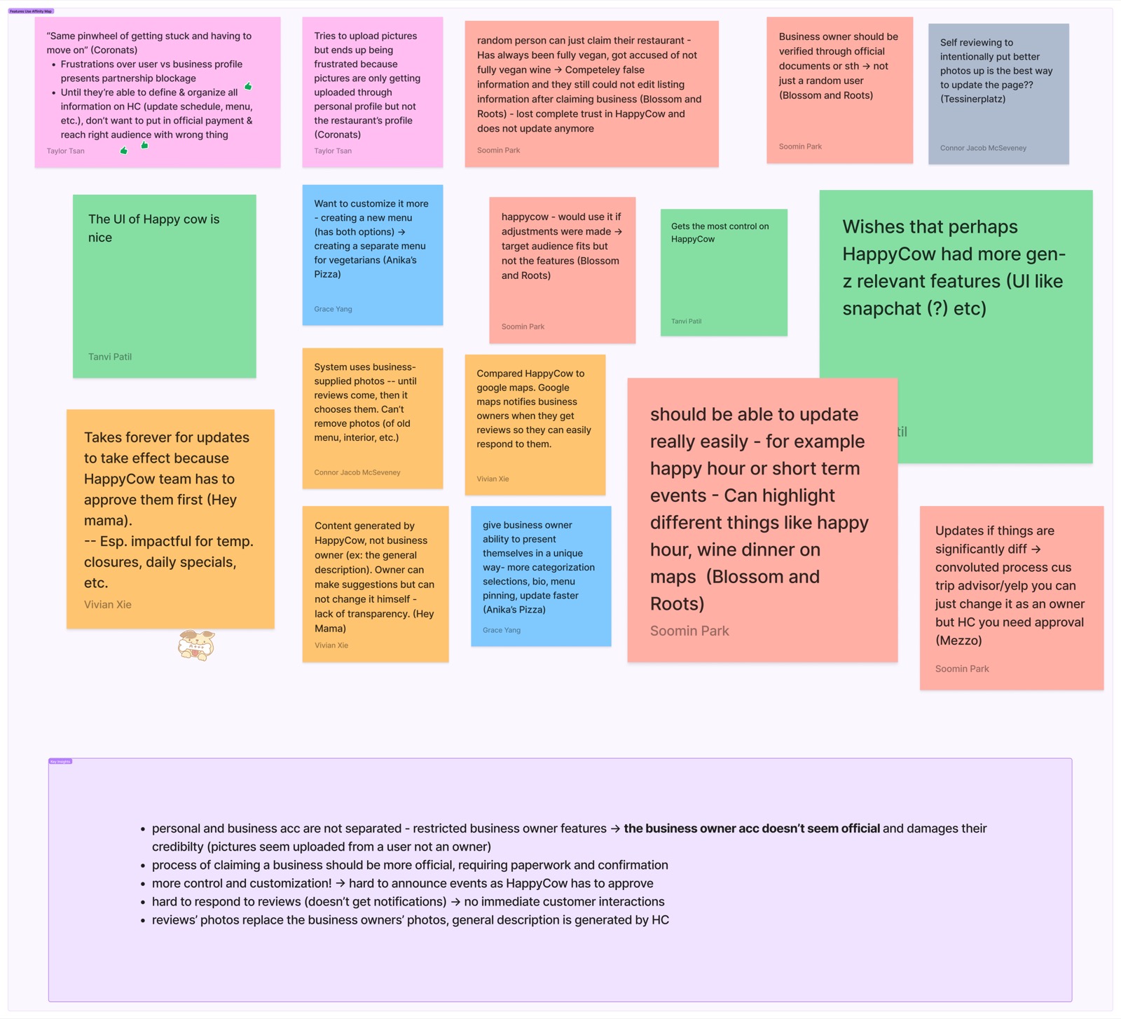
Features Use — 'Wishes HappyCow had more Gen-Z relevant features — UI like Snapchat, etc.'
Hover over image to magnify
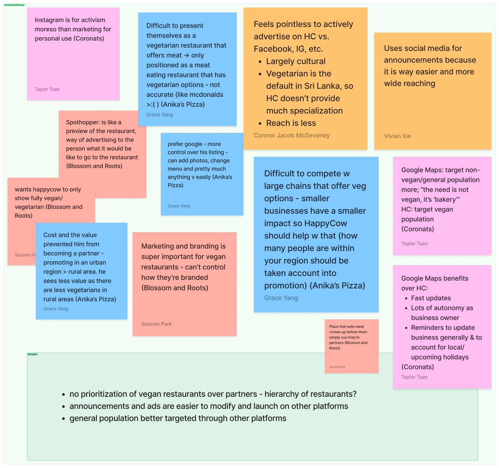
Advertisement — 'Feels pointless to actively advertise on HappyCow vs. Facebook or Instagram. Reach is less.'
Hover over image to magnify
Across all three maps, the same gap kept emerging: business owners had no reliable way to get featured on HappyCow, and the platform's discovery surface wasn't meeting younger users where they were. That became the foundation for the Weekly Menu Highlight.
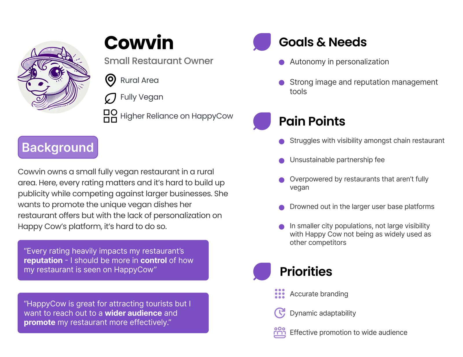
We also developed Cowvin — a user persona representing a small vegan business owner — to keep both audiences grounded in every design decision.
Cowvin — small vegan business owner persona, synthesized from interview and survey data.
Hover over image to magnify
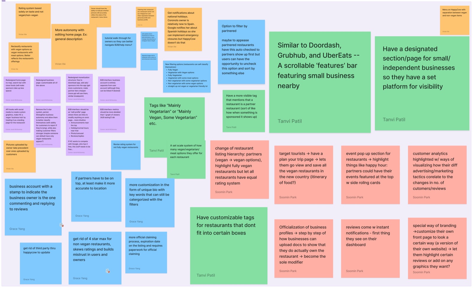
Step 4 — Crazy 8s Ideation
During the team's Crazy 8s session, I sketched two ideas that would eventually converge into the Weekly Menu Highlight:
- A scrollable "featured" bar — similar to DoorDash and UberEats — spotlighting small businesses nearby
- A dedicated section or page exclusively for independent restaurants, giving them a consistent platform for visibility
Crazy 8s — the team's rapid ideation session. My sketches explored scrollable featured bars and dedicated small business sections.
Hover over image to magnify
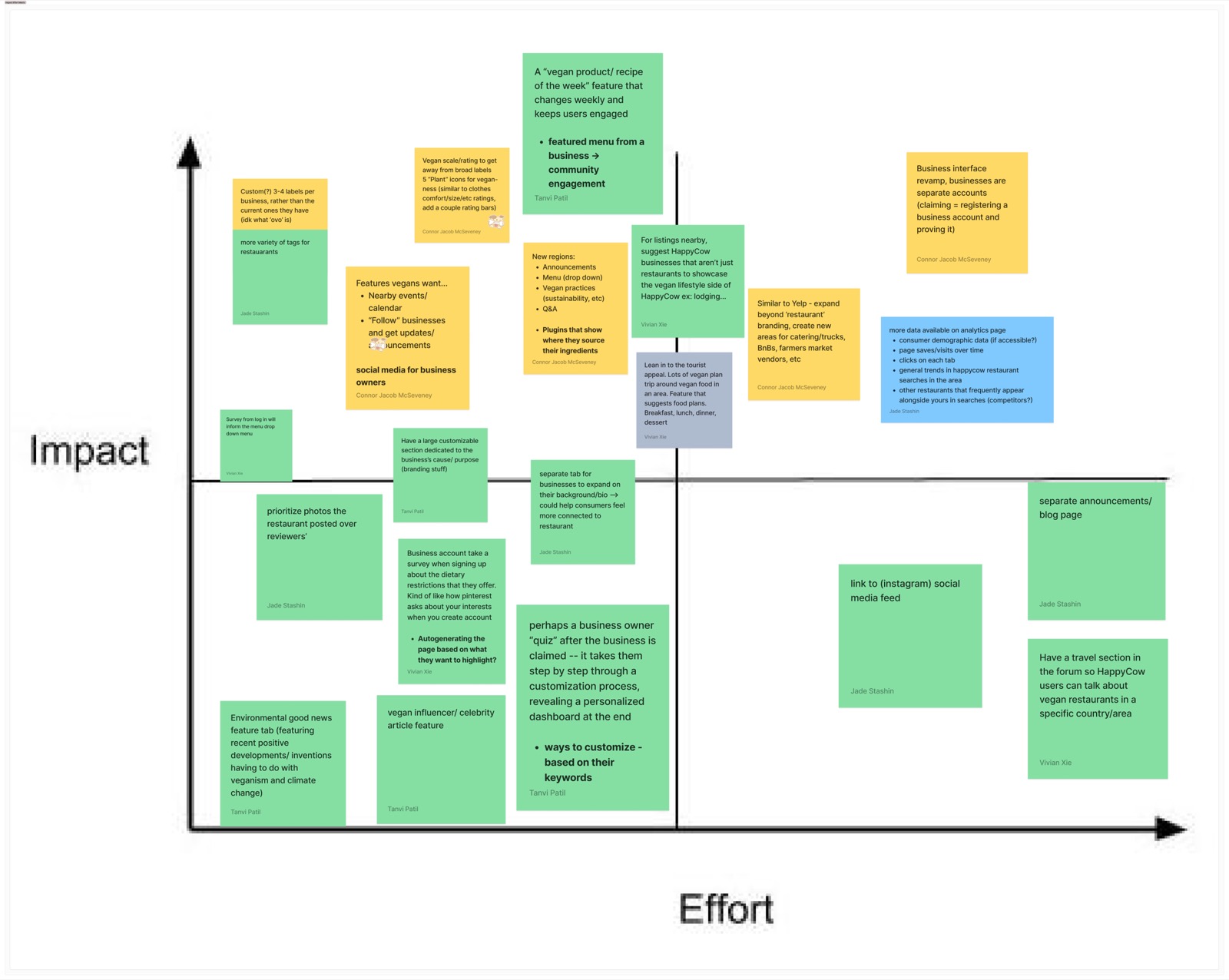
Step 5 — Impact/Effort Matrix
The team mapped all strong ideas against impact and effort. My initial concept — a "Vegan Product/Recipe of the Week" feature — landed in the low-to-mid effort, high impact quadrant. That idea became the seed I developed further into the Weekly Menu Highlight.
Impact/effort matrix — the 'Vegan Product/Recipe of the Week' concept scored high impact, low-to-mid effort. I developed it further into the Weekly Menu Highlight feature.
Hover over image to magnify
Concept Exploration
With the impact/effort matrix pointing us toward a weekly spotlight concept, I explored several directions before landing on the final feature. Each concept was grounded in the research but made different trade-offs.
Concept A — Restaurant Spotlight
A featured restaurant of the week on the home page. Simple and discoverable, but it tended to favor larger, more established businesses — exactly the visibility gap we were trying to close. It also didn't give users much to interact with.
Concept B — Community Picks
Users nominate and vote on their favorite dishes. Strong community potential, but it required heavy moderation and a critical mass of participation that couldn't be guaranteed, especially in smaller markets.
Concept C — Vegan Challenge
Gamified discovery through badges and rewards. Engaging, but the complexity pulled focus away from what business owners actually needed: straightforward visibility. It solved the wrong problem.
Concept D — Weekly Menu Highlight ✓
Spotlight a single dish from a small restaurant each week, with curated reviews and an archival library. This concept balanced all three goals simultaneously — business promotion, user discovery, and community engagement — without requiring moderation infrastructure or gamification overhead.
The Weekly Menu Highlight won because it was the only concept that served both sides of the platform at once: restaurants got meaningful, rotating exposure, and users got a low-effort way to discover somewhere new through peer voices they trusted.
My Role
Our team divided responsibility across three complementary features:
- Weekly Menu Highlight (my role) — spotlighting local restaurants through curated reviews and archival discovery
- Social Media Feed (two designers) — enabling users to connect and share dining experiences
- Customizable Business Profiles (one designer) — giving owners more control over how they appeared to users
I owned the Weekly Menu Highlight end-to-end: from proposing the concept, to wireframes, to the final high-fidelity interactive prototype.
Design Process
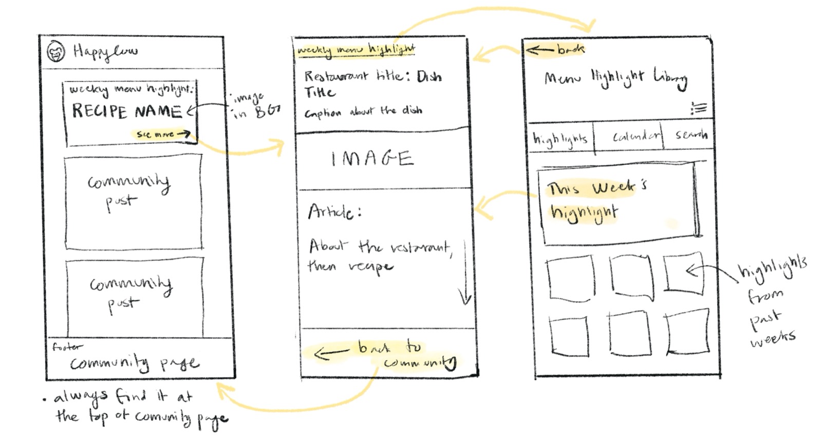
Lo-Fi — Procreate Sketches
Before opening Figma, I sketched the initial concept on Procreate to think through the layout and flow without getting caught up in details. The focus was on how the highlight widget would sit within the social feed, and how a user would navigate from the feed into the highlight page.
Lo-fi wireframe — Procreate sketch exploring the Weekly Menu Highlight layout and navigation flow.
Hover over image to magnify
Mid-Fi — Figma
With the concept validated by advisors, I moved into Figma to build out the three core screens of the feature: the weekly highlight page, the CTA linking to the community posts page, and the menu highlight library.
Community CTA — button linking to community posts about the featured restaurant.
Weekly Highlight page — curated restaurant dish with reviews and details.
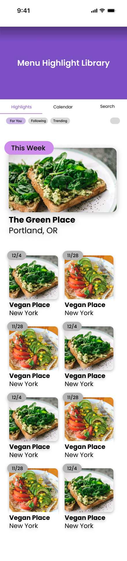
Menu Highlight Library — archived past highlights for ongoing discovery.
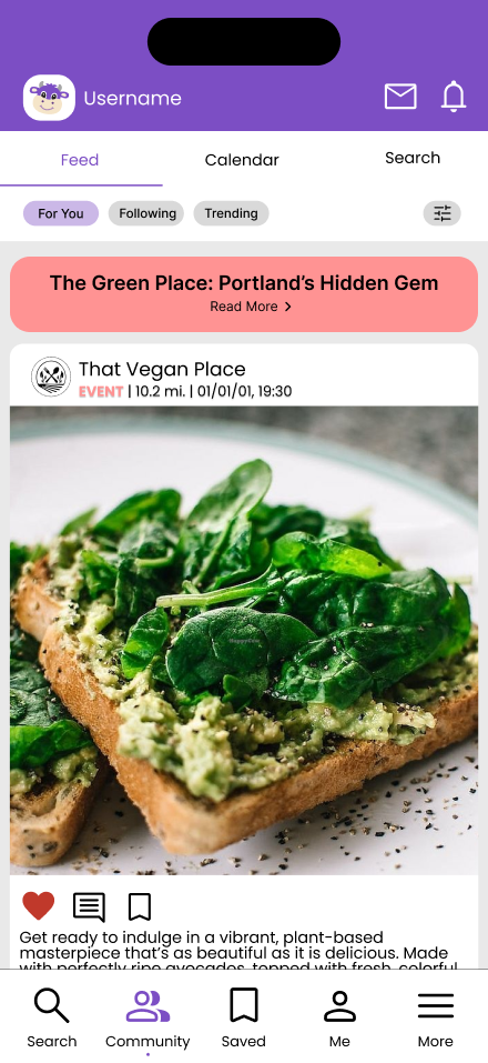
Hi-Fi — Interactive Prototype
The final high-fidelity prototype applied HappyCow's style guide and added the full interactive flow. A key addition in this stage was the Community Posts page — accessible via a button at the bottom of the Weekly Menu Highlight page, it surfaces community posts about the featured restaurant, closing the loop between business visibility and authentic peer engagement.
The Feature
Mobile — Consumer-Facing
- A highlight widget in the social feed spotlighted one featured restaurant each week
- A Restaurant Highlight Page showcased curated reviews and dish descriptions for that week's pick
- Clickable reviews linked directly into the social feed, driving user participation
- A Menu Highlight Library archived all past highlights — turning the feature into an ongoing discovery resource
Web — Business-Owner-Facing (Conceptual)
I did not design screens for the web-facing side, but I conceptualized how it would work alongside the consumer feature:
- Business owners could preview how their highlight would appear to consumers
- The view made the visibility benefit tangible — showing owners exactly how participation in the highlight program increased their reach
- Complemented the customizable business profiles designed by a teammate
This conceptual layer was important for validating the B2B case to HappyCow advisors — making clear that the feature served both sides of the platform, not just consumers.
The feedback loop: restaurants gained exposure → users discovered trustworthy peer recommendations → engagement drove more participation → more restaurants wanted to be featured.
Outcome
Our advisors at HappyCow responded enthusiastically — praising the novelty of the concept and the team's commitment to amplifying small businesses while building community. The prototype validated that our design direction aligned with HappyCow's goals of attracting younger users and strengthening the B2B side of the platform.
Reflection
This project gave me a clearer sense of how B2B and consumer-facing design are inseparable. Empowering businesses to present their best selves directly shapes consumer trust — and consumer trust, in turn, drives platform growth.
I also saw how much more powerful authentic social content is compared to traditional star ratings. A thoughtful review from a real person in your community carries weight that an aggregate score never can. Design isn't just about usability — it's about building systems where businesses and communities can reinforce each other.