7 Designers + 2 Project Leads (Invention Corps at Berkeley)
Co-led a bilingual self-guided tour for a historic SF nonprofit, making its stories and resources more accessible to the community.
Overview
The Women's Building is the first woman-owned and operated community center in the United States — a San Francisco landmark with over 40 years of history serving women, families, and communities.
As Design Lead and Project Co-Lead, I guided a team of 7 designers to create a bilingual (English/Spanish) self-guided tour that lets visitors explore the building's spaces and stories at their own pace, without relying on staff-led tours or straining a limited nonprofit budget.
The tour launched in August 2025. It runs every Tuesday, 10AM–3:30PM.
My Role
Co-Project Lead
Designed the project's week-by-week design timeline and sprint structure
Coordinated design deliverables and milestone pacing across 10 weeks
Design Lead
Led all design-based research — including competitive SWOT analysis, QR code delivery evaluation, and brand/component analysis
Ran workshops teaching Figma and Framer to the full team of 7 designers
Led on-site research on Tour Day — directed the building walkthrough, developed the questioning framework for our mentor interview, and synthesized findings into design direction
Facilitated all design work sessions across lo-fi, mid-fi, and hi-fi iterations
Oversaw and approved all final design deliverables
My co-lead owned team communications, scheduling, and content/text research.
The Problem
The Women's Building couldn't sustain staff-led tours due to budget cuts and limited capacity. Without a self-guided option, the building's story was going untold to most visitors.
The ask: design an accessible, maintainable, bilingual tour experience that works within the building's real constraints.
Constraints We Designed Around
These weren't edge cases — they shaped every major decision:
Photo licensing — mural images required explicit attribution legends; some photos had strict usage restrictions
Unreliable WiFi — connectivity inside the building was inconsistent; we minimized external links
Maintainability — TWB staff would own the content after handoff with no developer support
Space etiquette — rental spaces couldn't encourage wandering during active events
Brand in flux — TWB's website was redesigned mid-project; we adapted our palette accordingly
Bilingual from day one — English and Spanish throughout, not as an afterthought
Research — Tour Day
Before opening Figma, we needed to experience the building ourselves.
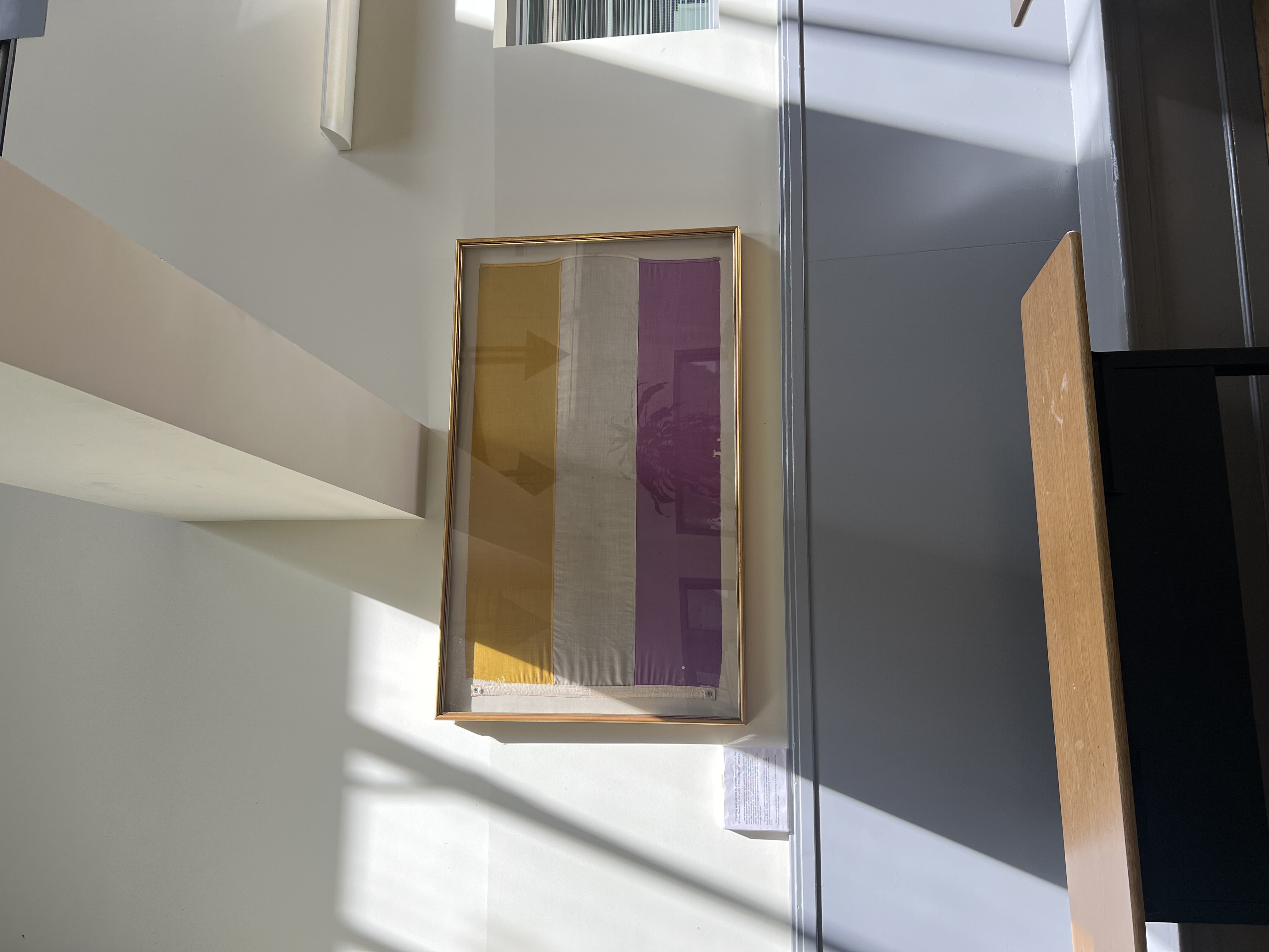
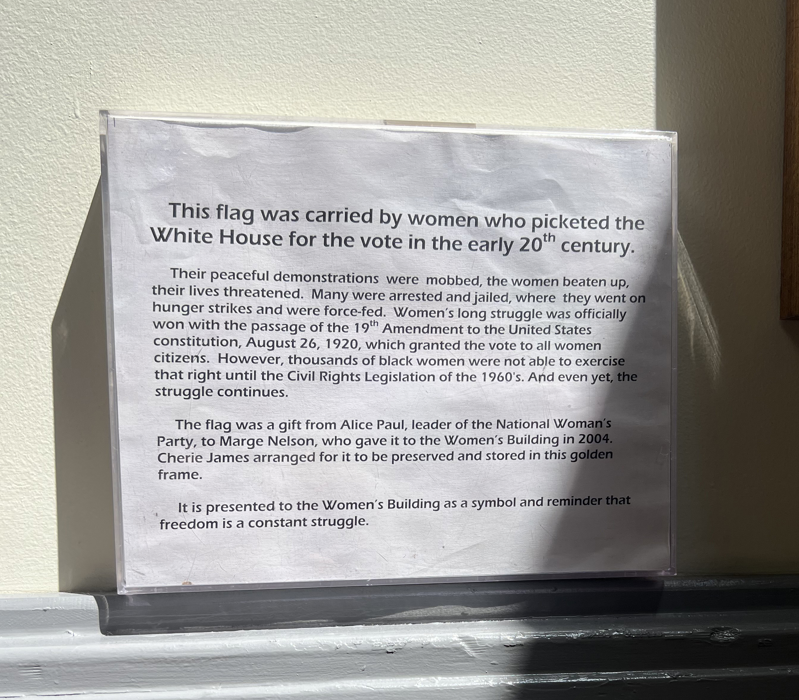
We visited The Women's Building in person for a full research day. Our mentor walked us through every stop, sharing the history and stories behind each space. We asked questions, took notes, photographed the building, and mapped out the wayfinding flow — putting ourselves directly in the shoes of a first-time visitor.
Afterward, we gathered in the building's conference room with TWB mentors and staff, presented our lo-fi and mid-fi concepts, and received direct in-person feedback. It was one of the most grounding research experiences of the project.
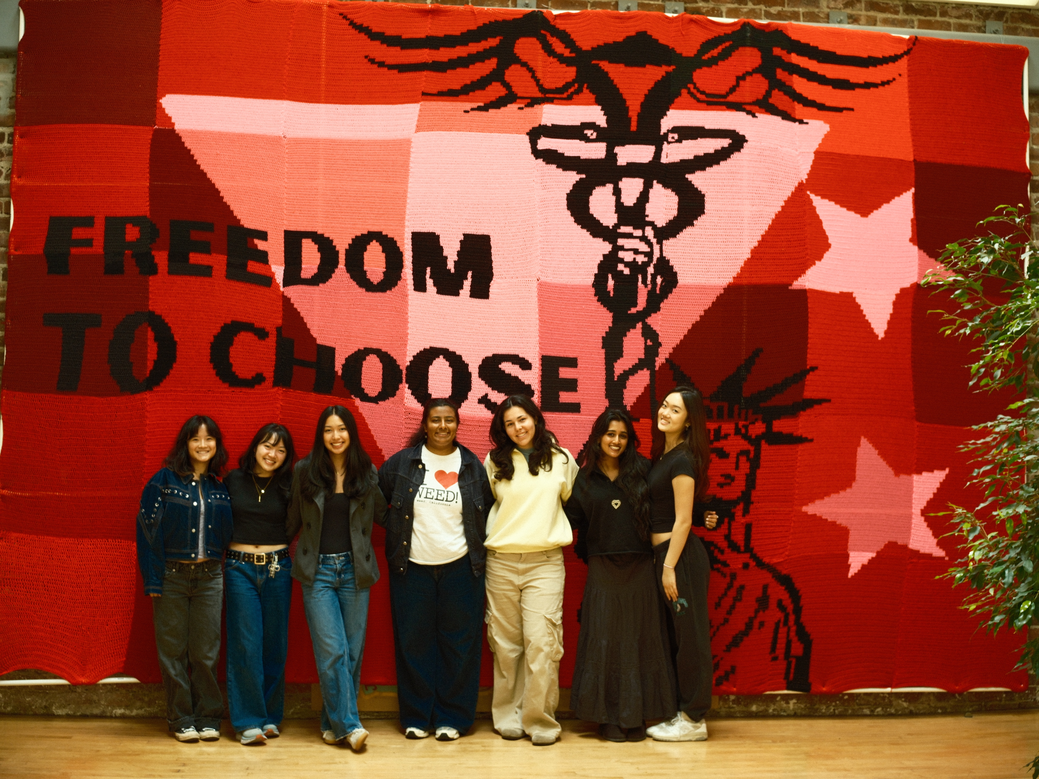
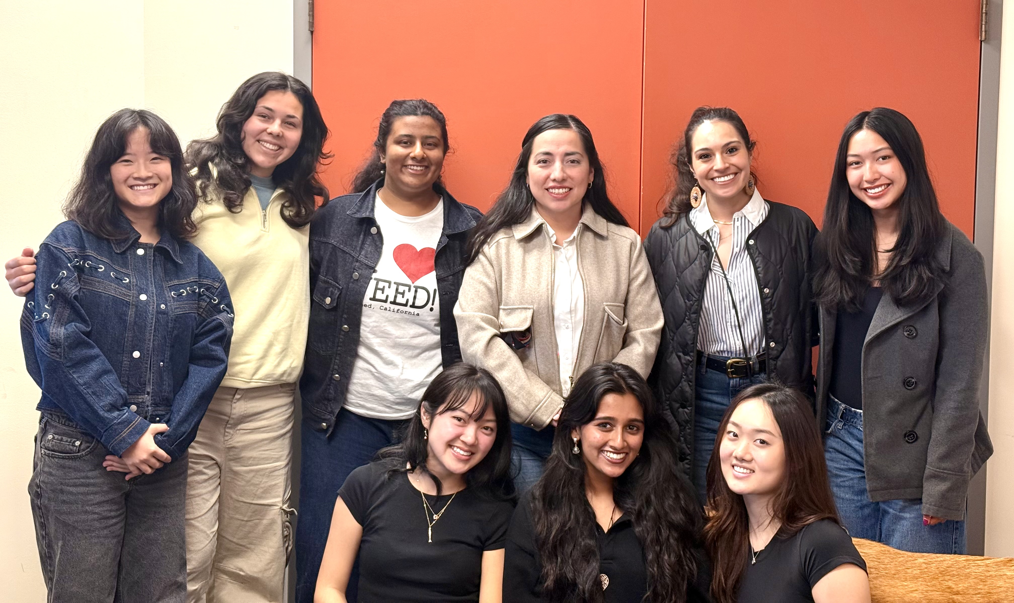
Tour Day — the full team visiting The Women's Building in person.
Presenting lo-fi concepts to TWB staff and mentors in the building's conference room.
Mapping the building — notes and photos informed the wayfinding flow.
Learning about the history of this building and the women who built it left us feeling deeply inspired and grateful to contribute to an institution like this.
Understanding each space firsthand helped us define stop content and visitor flow.
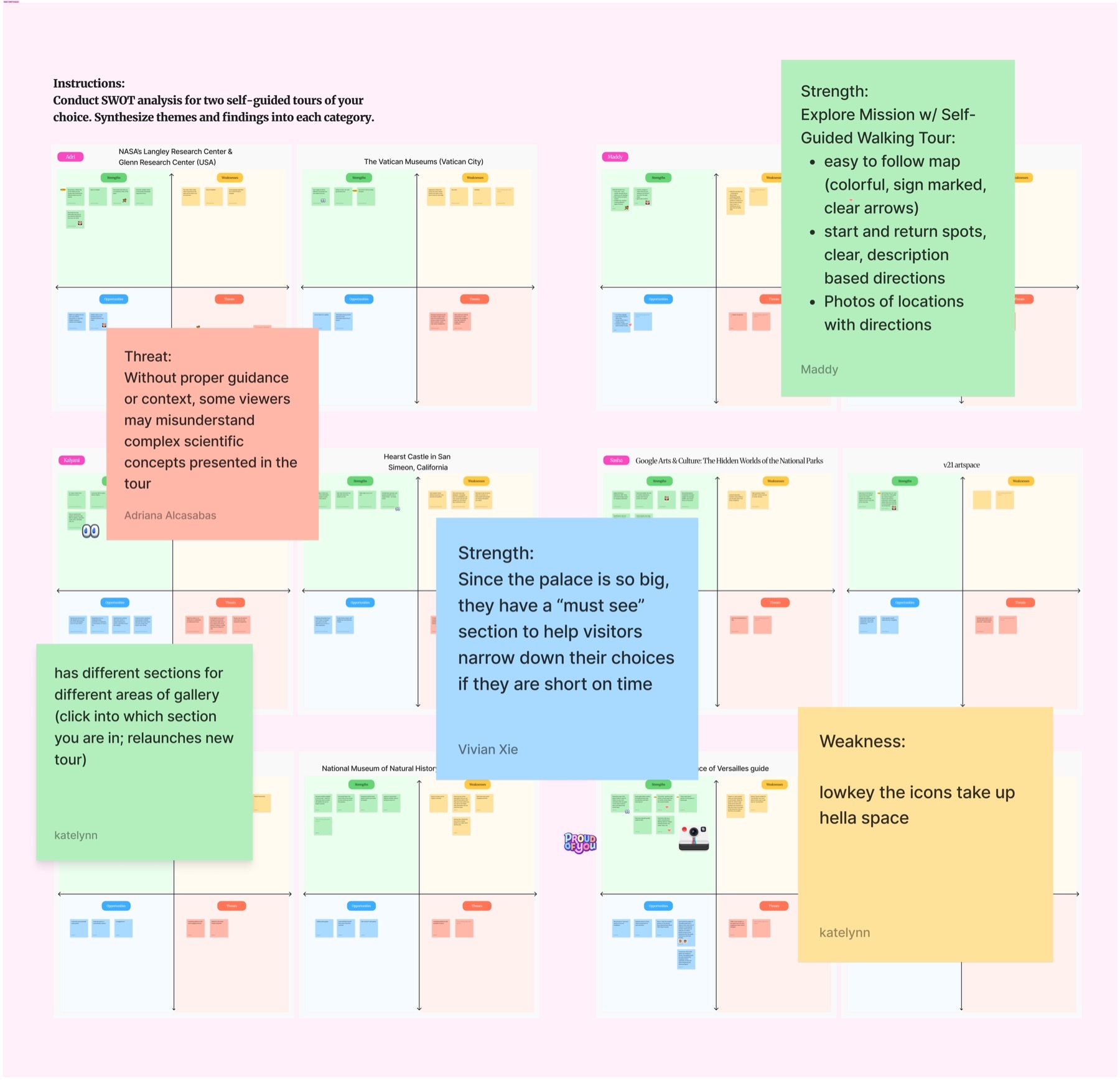
We also benchmarked comparable experiences — the Louvre, Smithsonian, Versailles guide app, Google Arts & Culture, and UC Berkeley tours — to identify what made self-guided experiences clear and accessible.
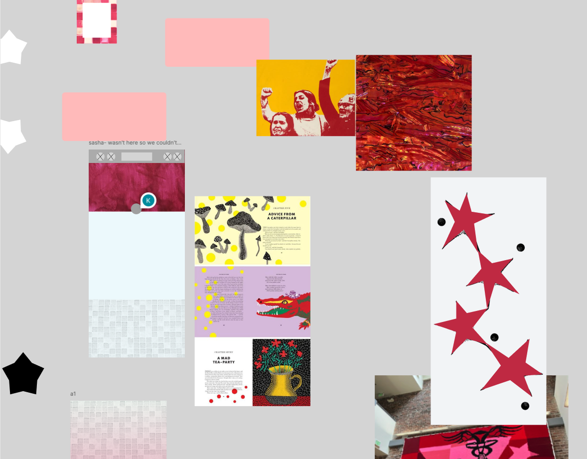
Week 1 — SWOT analysis of comparable tour experiences (Louvre, Smithsonian, Versailles, Google Arts & Culture).
Hover to magnify · swipe or click arrows to browse
Key Insights
1. Less scroll, more clarity
Users were overwhelmed by long content. Sections needed to be shorter, image-forward, with strong wayfinding — sticky stop names, a progress indicator, and floor context at all times.
2. Navigation between stops matters
Users expected to move between stops without re-scanning a QR code. In-UI navigation became a core requirement.
3. Design for the people who maintain it"Keep as simple as possible so it's more manageable for content updates." — TWB stakeholder. Maintainability was a design goal, not just a constraint.
Design Process
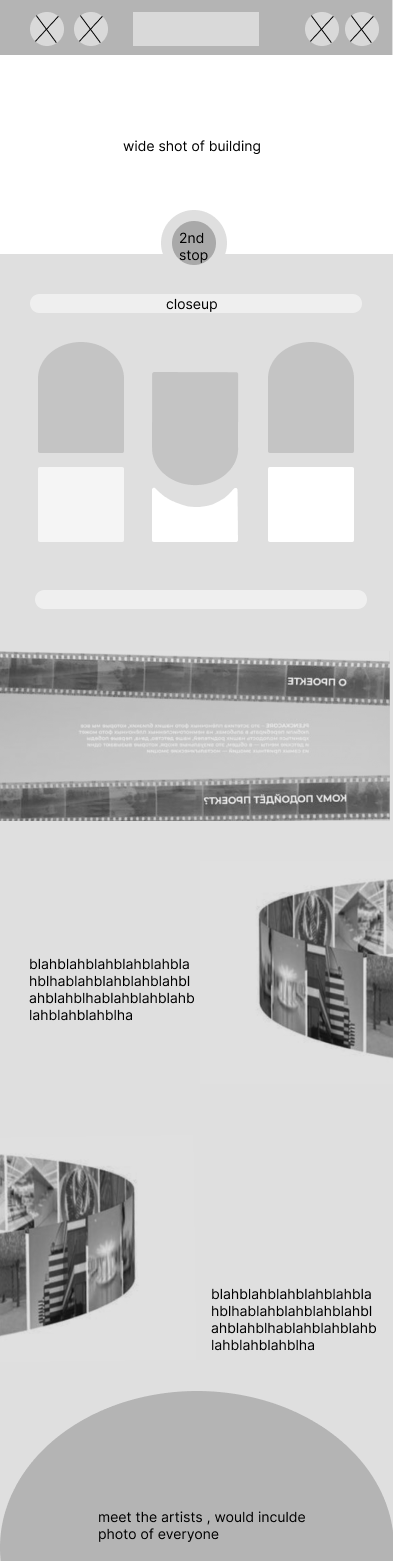
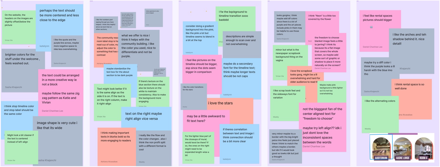
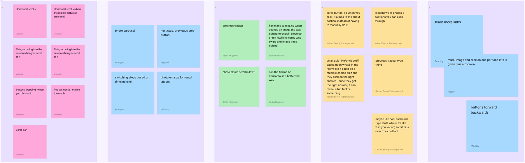
Lo-Fi
Early sketches were too text-heavy, lacked imagery, and had unclear component hierarchy. We identified which elements were truly necessary for each stop.
Community stop — text-heavy with unclear boundaries.
Second stop — testing different layout approaches.
Style references — establishing visual direction before mid-fi iteration.
Hover over image to magnify
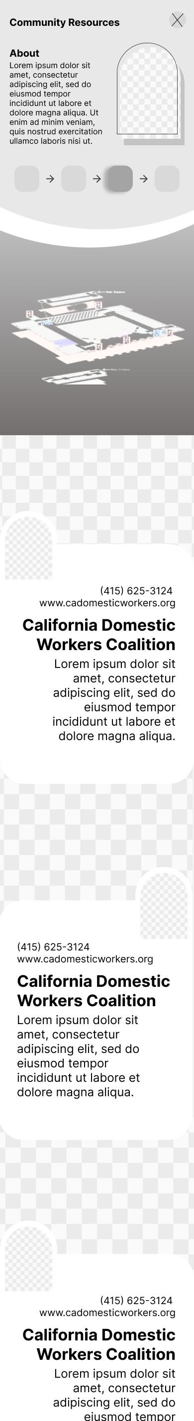
Mid-Fi
Midsemester showcase feedback drove significant iteration: shorter sections, clearer stop boundaries, improved photo-text ratio, and a stronger navigation model.
We also ran a dedicated UX writing workshop — standardizing terminology, voice, and structure across all stops. This kept the tour cohesive across 9 designers.
Mid-fi mockup — refined layout with progress indicator and floor context.
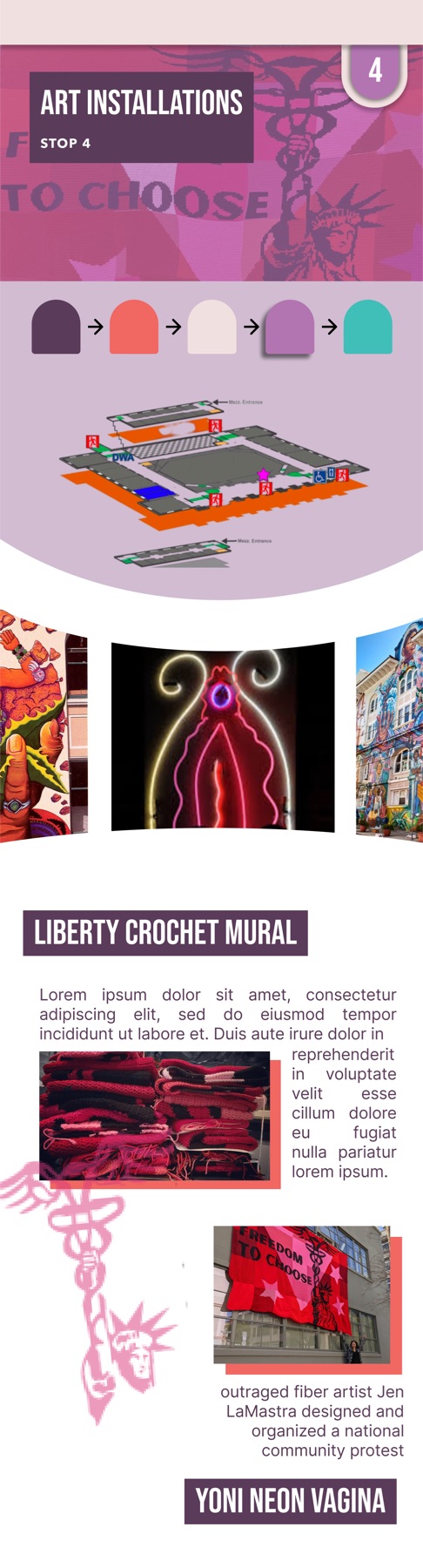
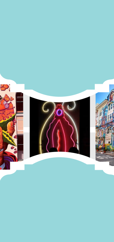
Art Installations — mural attribution in layout.
Testing overlays, arches, horizontal consistency.
Week 6 — 'Really like the stops at the top timeline & format. Stick to website color palette.'
Standardization system for stops:
Wide image header → Stop timeline → Map with floor highlights → Overlays/arches → Consistent horizontal elements
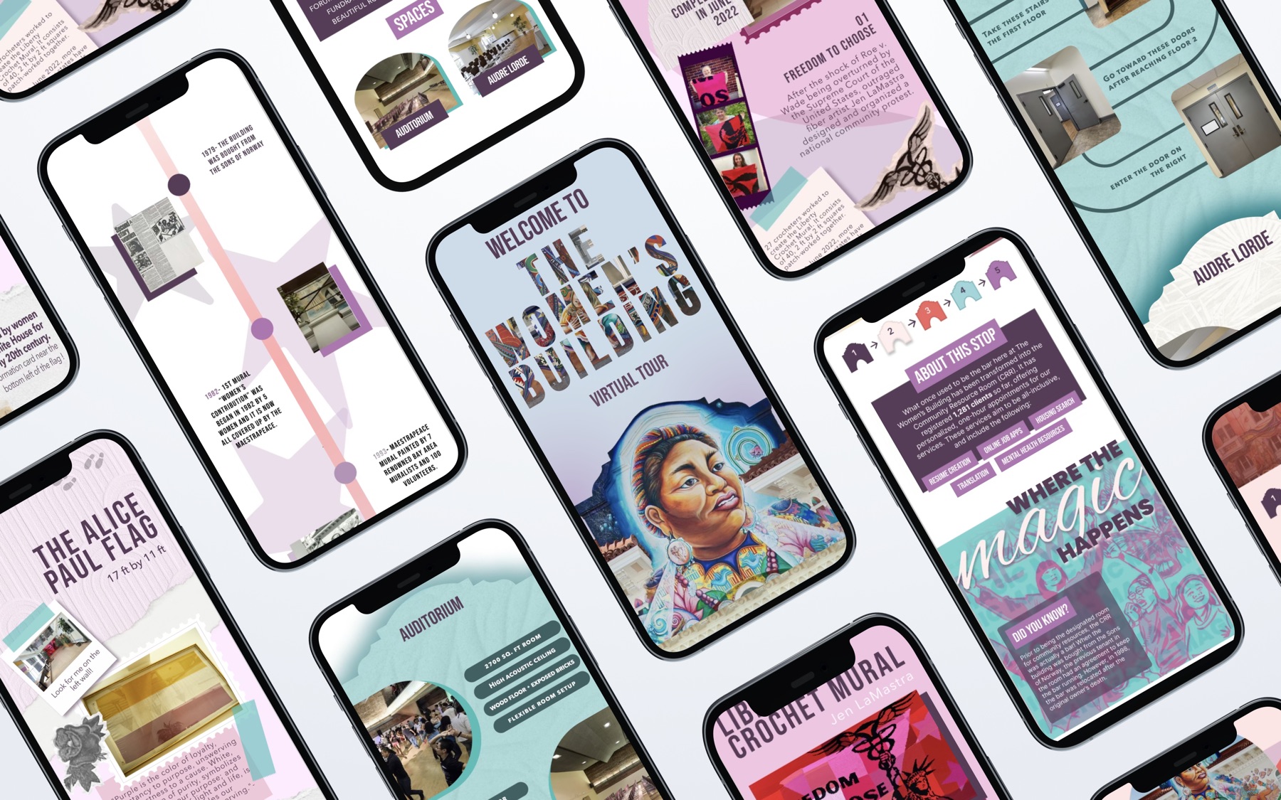
Final Design
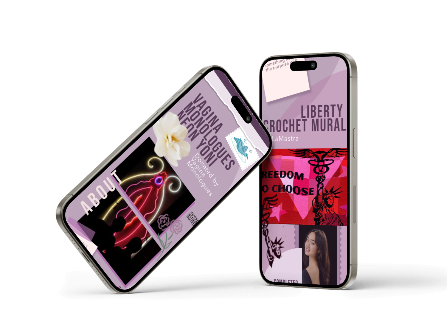
Final hi-fi — bilingual self-guided tour across all stops, optimized for mobile.
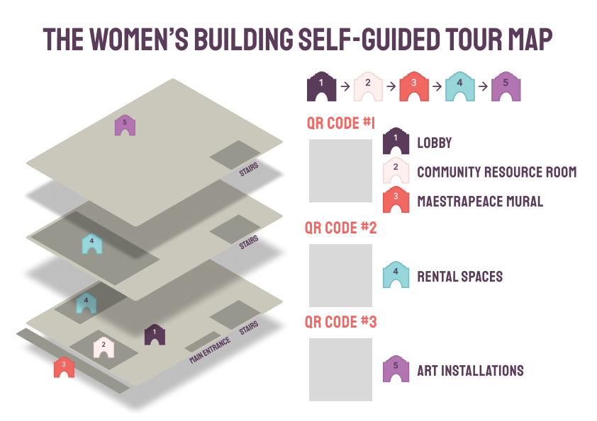
Physical map — laminated, 8×11, with QR codes and stop timeline. Handed to visitors at the entrance.
Handoff
We designed for the day we'd leave. TWB received:
Figma editing access — full ownership transfer of all design files
A Figma tutorial — step-by-step guide for QR creation, editing text/photos, updating colors, and relinking codes. Written for non-developers.
The physical map — laminated, card stock, horizontal layout with QR codes and stop timeline, ready to print
Impact & Outcome
Our mentors at The Women's Building were ecstatic with the final deliverable. They expressed immense gratitude for the resource we had created — and welcomed us to attend the grand opening of the tours. (We were unfortunately unable to make it, but that invitation meant everything.) They shared how meaningful it was to receive something made with such care.
The tour launched in August 2025 — available every Tuesday, 10AM–3:30PM, for $5 entry. Since launching, the tours have run consistently each month with overwhelmingly positive visitor feedback. Beyond engagement, visitors who complete the tour regularly purchase merchandise afterward — generating direct revenue for the nonprofit at a critical time. For a building navigating budget cuts and limited staff capacity, a self-sustaining bilingual experience that the staff can update independently, with no developer required, has made a real difference.
Knowing that visitors are now experiencing the building's history and stories through something our team built is something I carry with real pride.
"Tanvi was an exceptional project lead and designer. She is organized, communicative, and possesses a remarkable eye for detail. Her natural ability to incorporate every nuance of our organization into the project was incredible; she seamlessly blended the new product into our existing ecosystem while pushing us to adopt a fresh perspective on how we engage with our community. Ultimately, our new self-guided tours created a more inclusive environment and drove revenue growth for our non-profit at a critical time."
— Betty Azori, The Women's Building
Reflection
This project reminded me why I chose design in the first place. I witnessed firsthand how creativity — when paired with empathy and compassion — can uplift communities, connect people, and honor culture. Learning about the sheer impact The Women's Building has on the people and families around it made the work feel urgent in the best way possible. It sparked something in our team that made us all want to give it everything we had. Seeing it in use brings me genuine pride and joy.
On leadership: This wasn't my first time in a leadership role, but it was my first time co-leading a team of seven talented designers. I learned how to be organized, proactive, and attentive — and how to hold space for both productivity and the wellbeing of my team at the same time. I consistently showed up with snacks. We planned bonding activities and warm-up exercises every week. At the end of the project, I made everyone Women's Building-themed bouquets and wrote each person an individualized handwritten card telling them how proud I was of them.
I genuinely believe that when your teammates feel seen, heard, and cared for, they bring their best work. This team proved that to me.
I also found a true co-lead in Taylor Tsan. We divided responsibilities according to what each of us did best, communicated openly and consistently, and trusted each other completely. Because of that, the whole project ran like a well-oiled machine.
If I could do this project all over again, I would — without hesitation. One of my favorite, most memorable, and most rewarding experiences at Berkeley.