LiveWine
Collaborated with startup leadership to create investor-ready prototypes and branded experiences for a growing wine marketplace.
Overview
LiveWine is a boutique wine startup connecting consumers with independent wineries. Their goal: make wine discovery more accessible to younger audiences (ages 21–30) who are curious about wine but put off by the formality and gatekeeping of traditional buying experiences — while also giving independent wineries a compelling platform to share their wines, events, and brand stories.
The CEO felt the existing platform needed a fresher, more youthful sensibility. I was brought in as a freelance UX designer to collaborate with the existing team, introduce new design thinking, and deliver work that balanced the startup's brand identity with modern appeal.
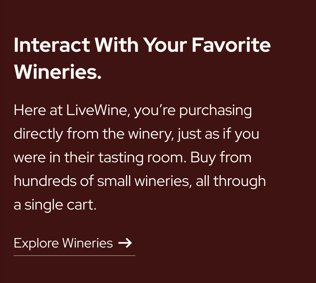
My deliverables: a redesigned mobile homepage for consumers, and web showcase pages for four independent partner wineries.
Note: The winery showcase pages are covered under NDA and cannot be shared. All visuals in this case study are from the homepage redesign process.
The Challenge
Two intertwined audiences, two distinct needs:
Young wine drinkers (21–30) — curious but easily overwhelmed by traditional wine experiences. They respond to clean, spacious layouts, strong imagery, and approachable language. Crowded interfaces or long text blocks lose them quickly.
Independent wineries — looking for a platform that helped them stand out and connect with a new generation of drinkers, not just list their inventory.
The additional challenge: an in-house UX designer had already established the platform's visual foundation. My job was to evolve it — introducing a fresher design language without discarding what existed, and doing it while reporting directly to the CEO, COO, CTO, and founder.
Phase 1 — Mobile Remake of the Existing Site
My first task was to recreate the existing website design for mobile. The original site — built by a previous designer — hadn't been designed with younger audiences in mind. The color schemes were odd, the layouts unintuitive, and nothing about it felt warm or approachable.
Translating it to mobile exposed those problems clearly:
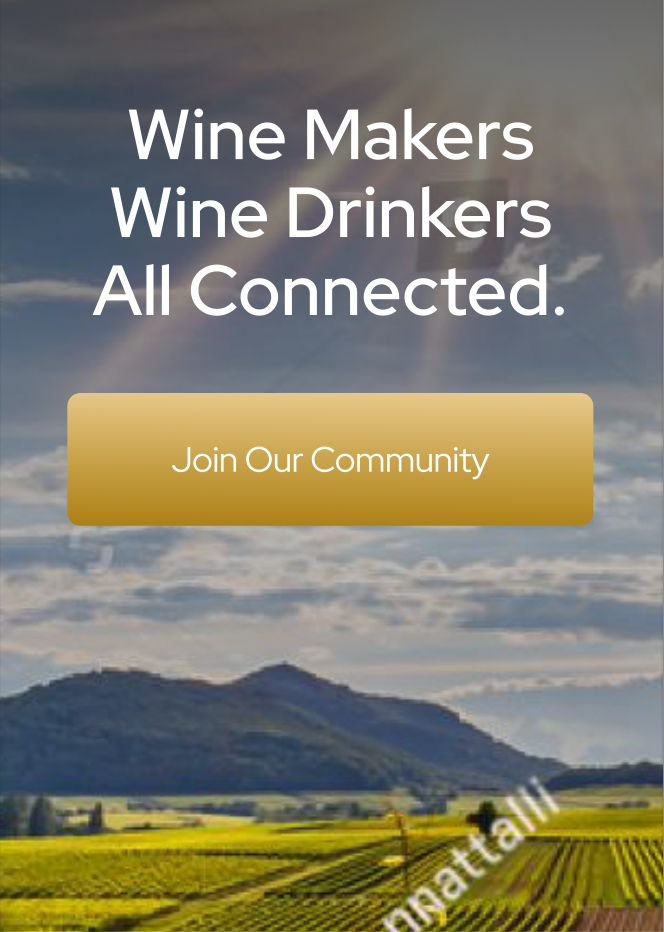
Hero section: dated image, odd button color, doesn't communicate 'farmer's market.'
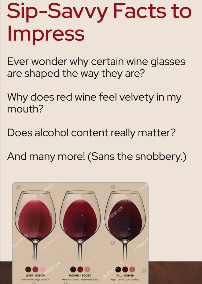
Facts section: text-heavy, no visual hierarchy, dull colors, no line of motion for the eye.
After completing the remake, I presented my observations to Gayle (the CEO) and made the case that the existing design direction wasn't suited for the audience they were trying to reach. She agreed — and asked to see my completely new take on it.
Phase 2 — Version 1: Modern & Sleek
My first original design explored modern mobile layouts with a clean, structured aesthetic. Key decisions:
- A completely new navbar — sleek, minimal, immediately implementable. The team adopted it right away.
- A striking hero image — replacing the mismatched original with something that actually stopped the scroll.
- Modern image layouts — symmetrical, with clear visual hierarchy and intentional whitespace.
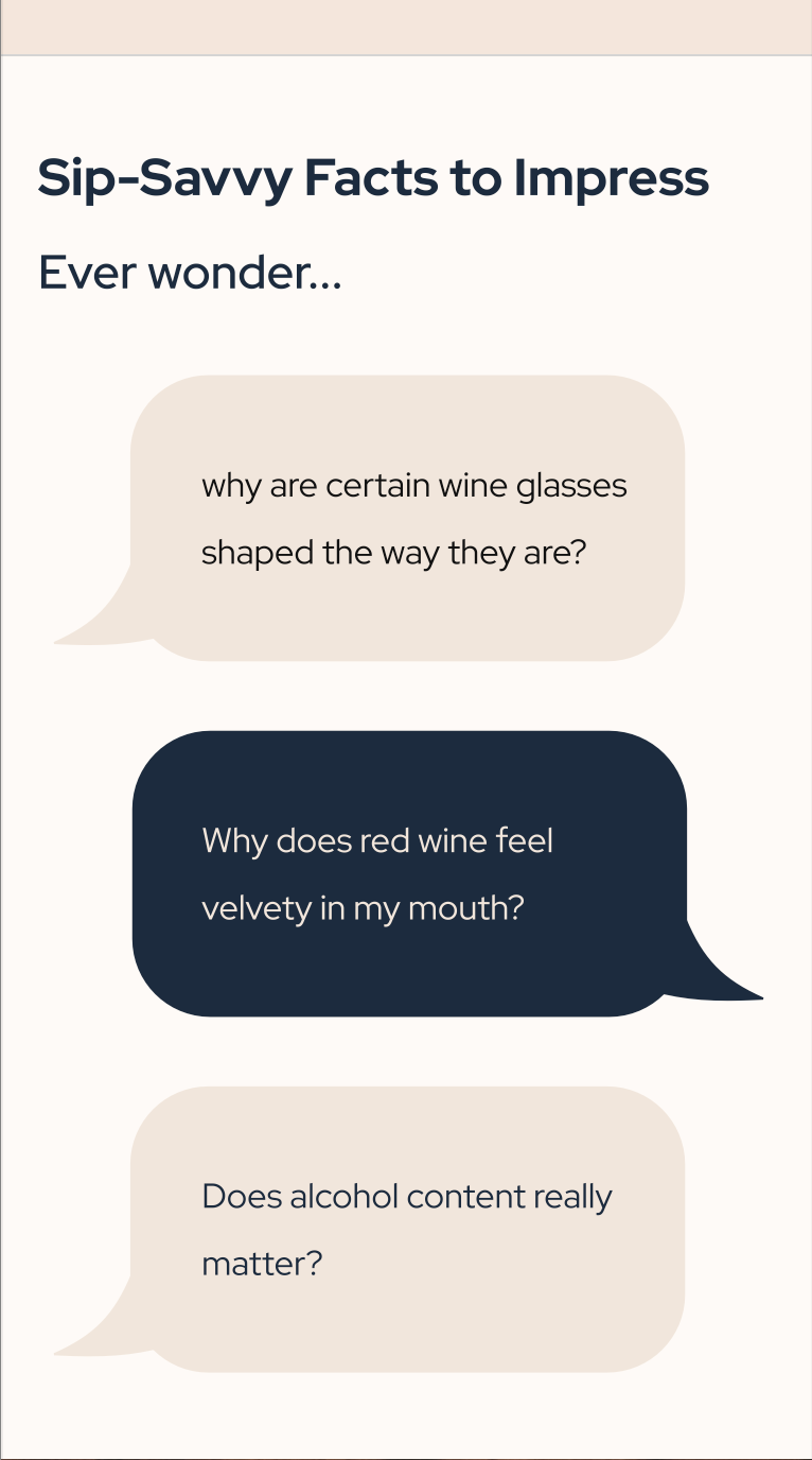
- A carousel for the information-heavy section — distributing dense content across slides instead of dumping it on one screen.
- Text-bubble format for the AI helper section — conversational bubbles instead of plain body text, making it feel approachable and easy to scan for younger users.

Version 1 — clean, structured, modern. New navbar, striking hero, carousel layout.
The feedback: they loved the hero concept and thought it felt much cleaner. But it read as too tech-forward and bland — they still wanted that organic, farmer's market warmth.
Phase 3 — Version 2: Warmth & Texture
The second iteration explored how to bring the farmer's market feeling back without sacrificing the modern structure I'd established. I experimented with textures, colors, and imagery:
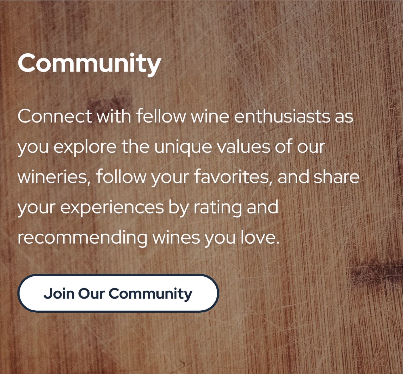
Wooden texture — evoking wine barrels and outdoor markets.
Wine-red background — warm and on-brand, tested against other sections.
I also redesigned the facts section with the new color palette — sage green and wine red replacing the cold, generic tones of version 1. Here's the before and after:
Before — clean but cold. The bubbles read as tech-forward, not warm.
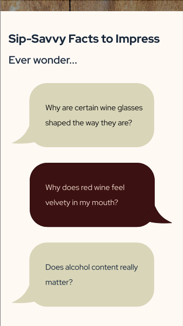
After — sage green and wine red. Same format, completely different feeling.
For the hero, I tested several images before landing on a wine-pouring shot that captured the warmth and energy of the brand. That image has since been implemented in LiveWine's current mobile page.

Version 2 — warm textures, sage green and wine red, farmer's market feel.
Outcome
The current LiveWine mobile page is a hybrid of my initial mobile remake and my redesign — a direct reflection of the design evolution documented here. The navbar I designed in Version 1 was implemented immediately. The wine-pouring hero image I selected is live on their site today.
The winery showcase pages I designed were presented to the four partner wineries, who responded with genuine excitement. The COO shared that they loved seeing their personalized pages come to life within the LiveWine platform. (These pages are protected under NDA and cannot be displayed here.)
Most significantly, the interactive prototypes I built were used in investor pitch presentations during the startup's funding phase. The CEO later commissioned me to design the company's business cards — extending the visual identity I'd established throughout the project.
Reflection
This project clarified something I'd sensed but hadn't yet articulated: design is a language, and when spoken fluently, it can recreate real-world emotions and foster authentic human connection. The warmth of a farmer's market, the ease of a casual drink with friends — these are feelings, not just aesthetics. Translating them into a digital interface is the work.
Freelancing also pushed me in ways a structured internship didn't. There was no project manager handing me tickets. I scheduled my own check-ins, interpreted abstract feedback, and advocated for design decisions in a room with the executive team. I learned to truly listen to clients while also offering my own point of view — balancing their vision with my craft to create something neither of us could have made alone.