Thalassomania
Designing a Twitch-inspired streaming interface for a horror film.
All artwork, film clips, and visual assets from Thalassomania are the property of Chapman University and the creators of the film. Used here solely to document my UI design and motion graphics contributions.
The Challenge
Thalassomania is a Chapman University senior thesis animated horror film following Priya and Harlow — the “Urbex Girls” — as they livestream their exploration of an abandoned underwater theme park. The entire film unfolds through the perspective of the stream itself, complete with live comments, viewer gifts, emoji reactions, and real-time audience stats.
The filmmakers needed a way to overlay these livestream elements directly onto animated scenes — and more importantly, they needed a workflow that let them customize comments, reactions, and timing throughout production without rebuilding the graphics from scratch for every shot.
Research & Inspiration
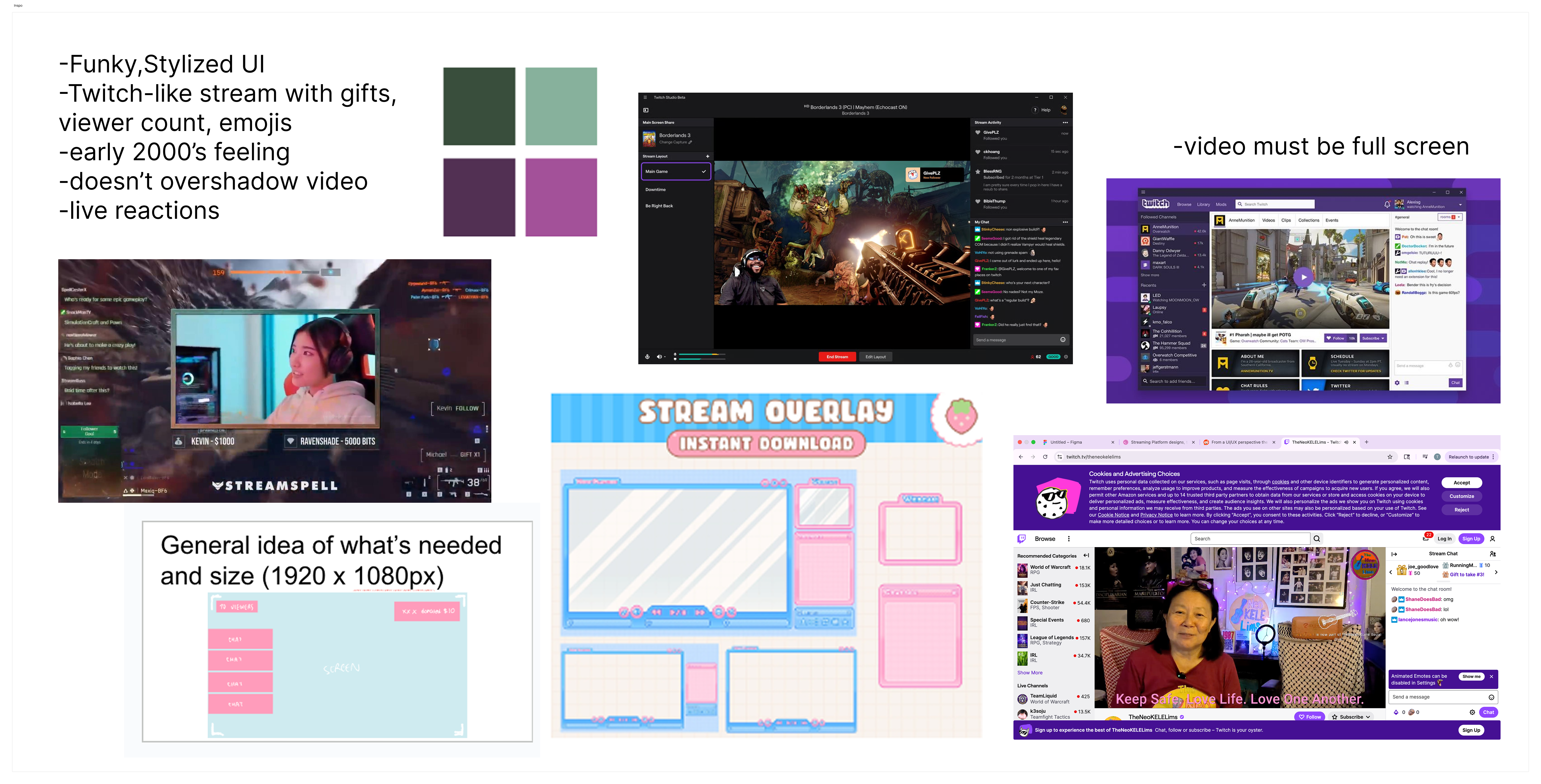
Before touching Figma, I spent time studying how real streaming platforms work — how comments appear and disappear, how gifts animate in, how viewer counts update, and how reactions layer over video. I also gathered visual references for the film’s aesthetic: early 2000s web design, pixelated text, and the slightly glitchy feel of retro livestreams.
Lo-Fi Mockups
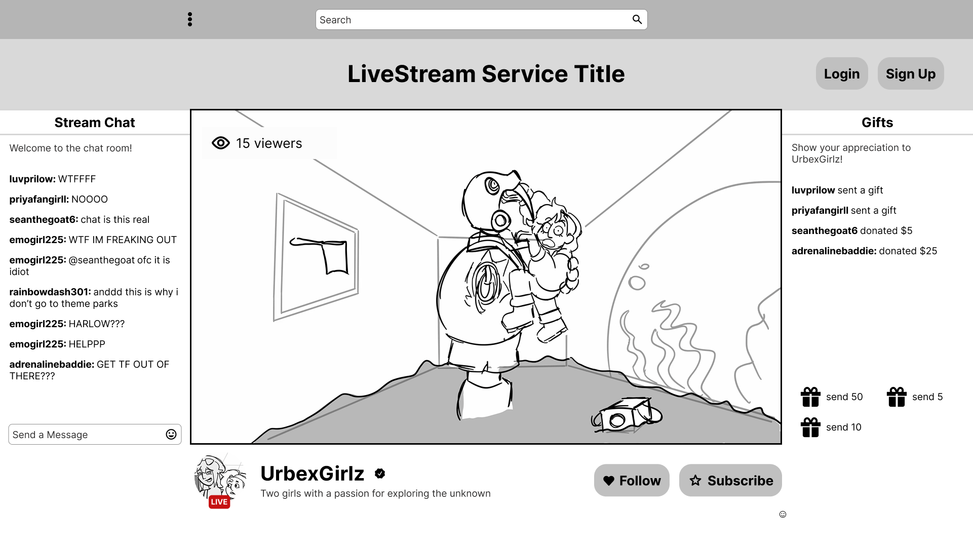
My first mockup explored a more traditional streaming layout — but it wasn’t quite right. The filmmakers wanted the video to remain completely full screen; the audience should only see other people’s reactions overlaid on top. This wasn’t a user-facing UI in the conventional sense — it was a layer on top of the film itself.
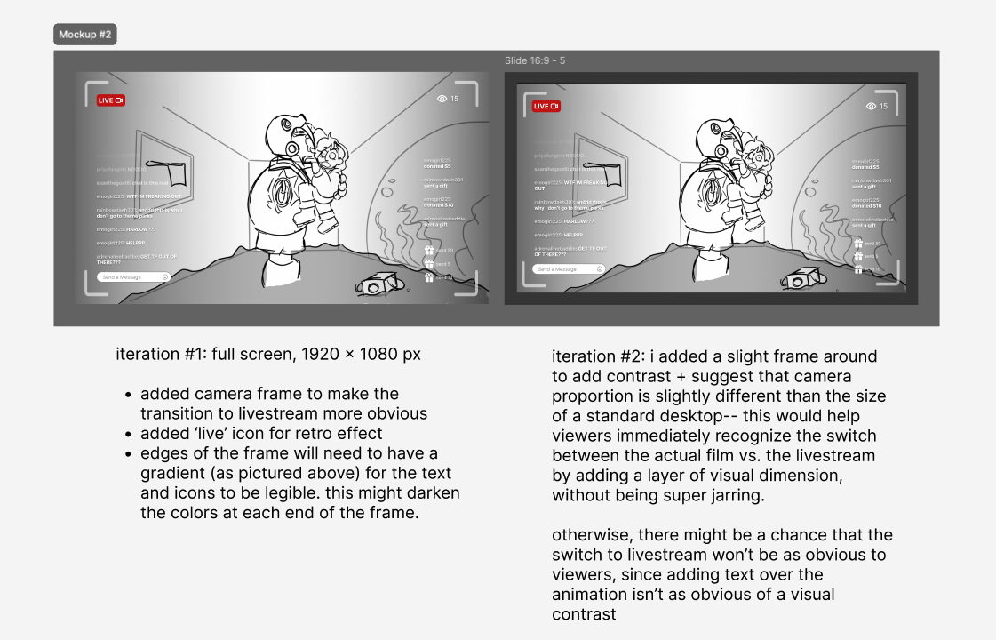
I iterated and produced Mockup 2 — two versions, one with a black frame and one without. This time the video fills the entire screen, with reactions and comments floating over it. I added a camera frame to make the transition into livestream feel more deliberate, a “LIVE” icon for the retro vibe, and a gradient along the edges to improve text legibility without covering the scene. The filmmakers liked this direction.
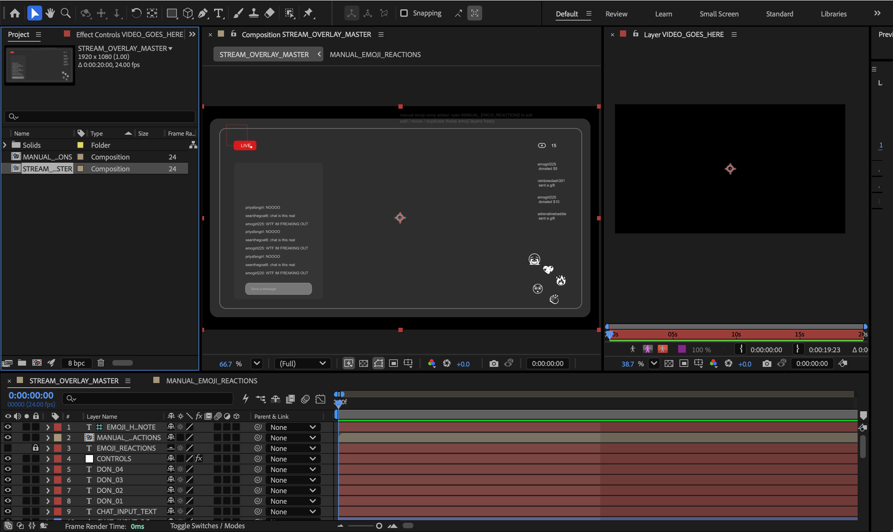
The After Effects Deliverable
With the direction locked in, I built the full system in After Effects — a modular, customizable comp file that the animation team could drop into any scene. Everything was labeled clearly, including where to insert their video. I designed it so they could edit comment text, swap in their own hand-drawn emojis, and adjust the aesthetic without touching any of the technical structure underneath.
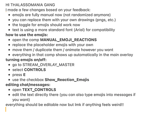
There were a few iterations along the way. For example, I initially made the emojis randomized — but the team wanted direct control over which ones appeared and when, so I reworked that system. Each iteration was handed off with written notes on what changed and clear directions on how to use it.
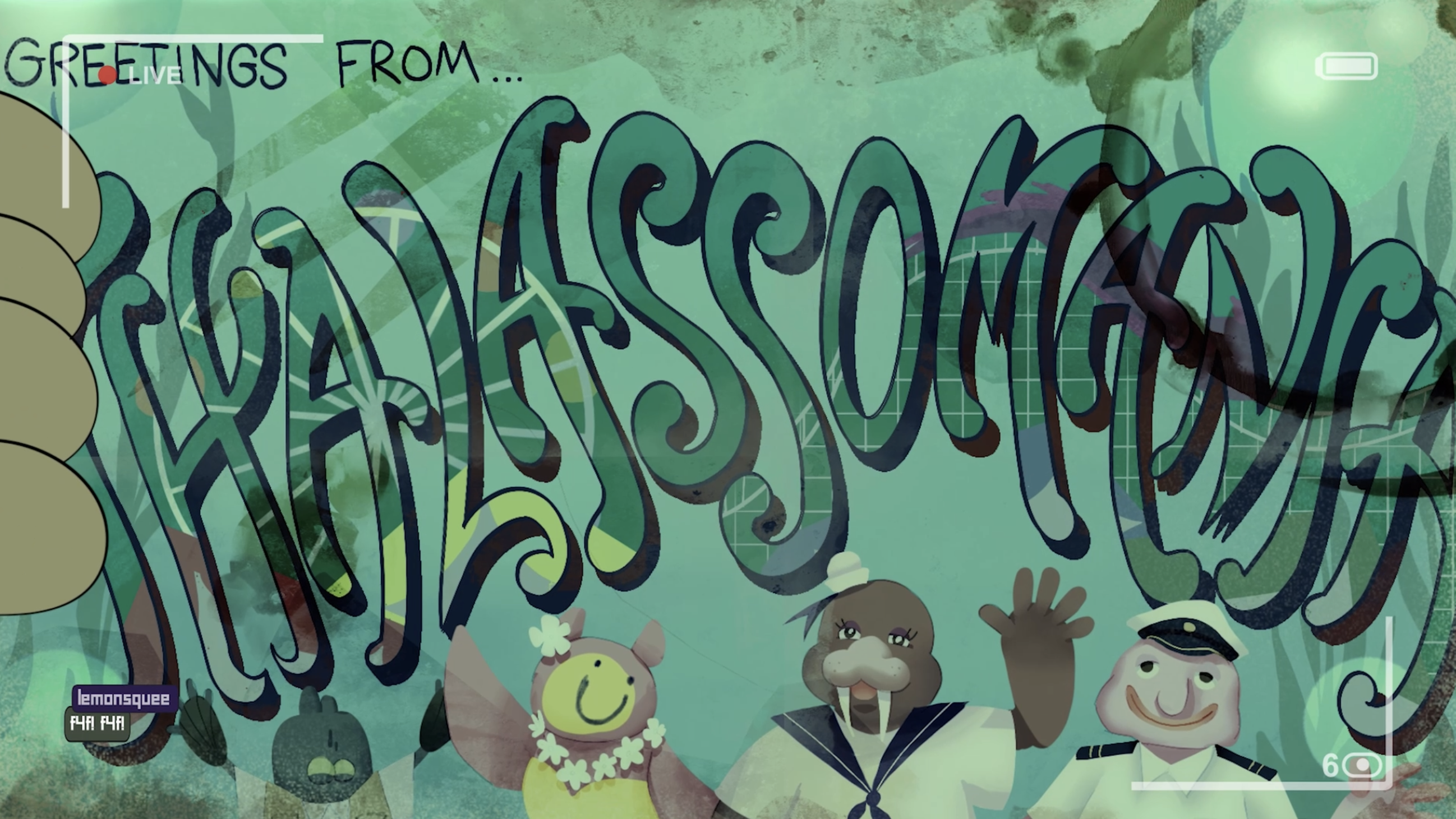
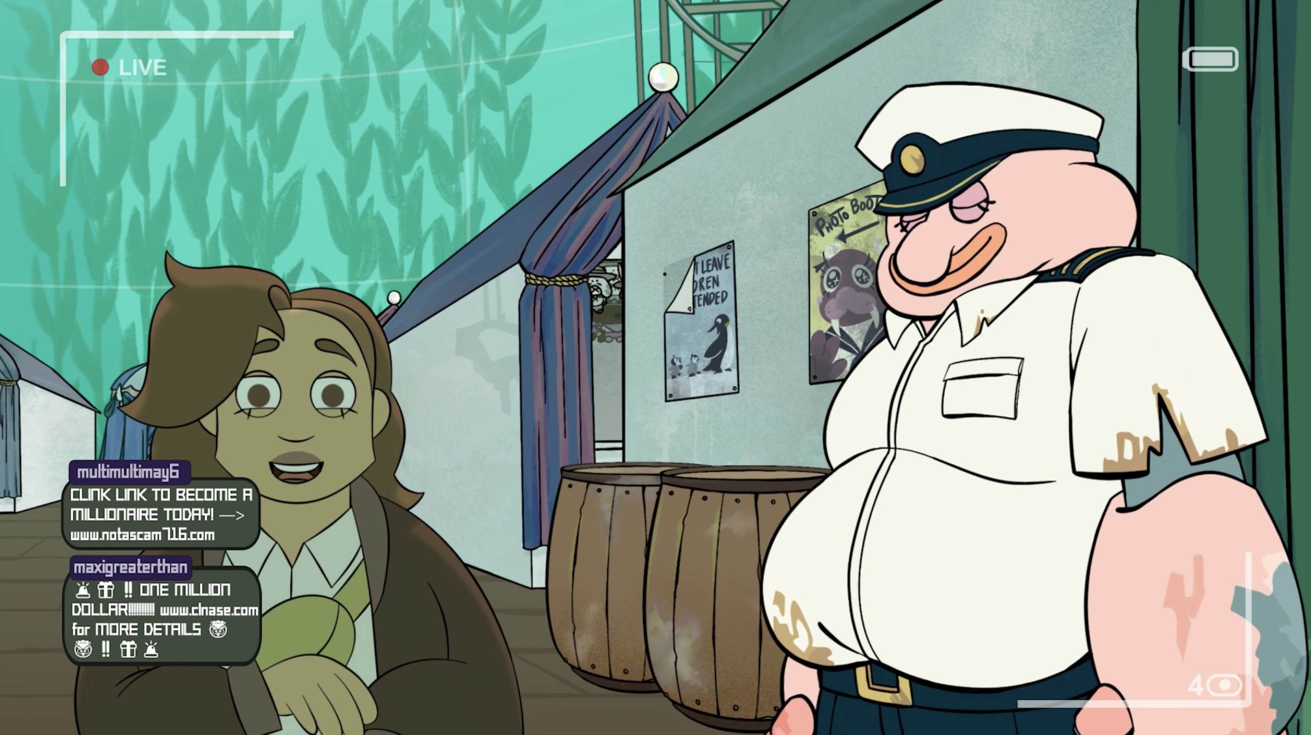
The Final Result
Below is a screenshot of the UI as it appears in a final frame of the film, and a short clip from the finished product showing how the livestream overlay looks in motion.
Reflection
Looking back, this project was genuine systems thinking. It forced me to consider not just how something looks, but how it will actually be used and consumed by the people making the film. I wasn’t building a design — I was building an entire system to make their production process as smooth as possible. Every decision had to account for someone else’s workflow, not just my own aesthetic preferences.
I also learned an enormous amount about filmmaking and animation along the way — so much so that they even brought me in to help with cleanup animation on one of their scenes. That was something I never expected, and it made the collaboration feel like so much more than a design handoff.
I’m genuinely grateful to have worked alongside such a talented group of artists and creatives, and I hope to be part of more projects like this.